
Four days down, one to go! I know I love the print room but I'm absolutely shattered, don't think I have any energy left to go back in tomorrow :( just one more push and then its the weekend, so I have to do it! Although my feet are totally hating me for it, wish I hadn't left my foot spa at hom, oh well I'll have to rely on the trusty hot water bottle lol.
Anyway so I think today went well, I think I may have got another couple of final samples out of it which is good, and I think I know what print is now going on to my cape and I also know what print I'll probably use on the top I'm going to make... thinking I want to make a skirt now as well... hmmm... only got six weeks left so I need to use this time wisely! So we'll see if the extra skirt happens but it would help me towards the first I really want... but we'll see!
I arrived in the print room at 9:15am this morning, had the room to myself for a little while - TOTAL BLISS! If only I could have the entire room to myself more often.

Did some more tie dying last night (going to but a tutorial up on the weekend of how to tie dye for those that don't know), and here's my first print of the day on it. I achieved the multi-coloured effect by running three colours through my screen at once. I think its very effective and its one of many ways to bring the collection together. I quite like this one too.

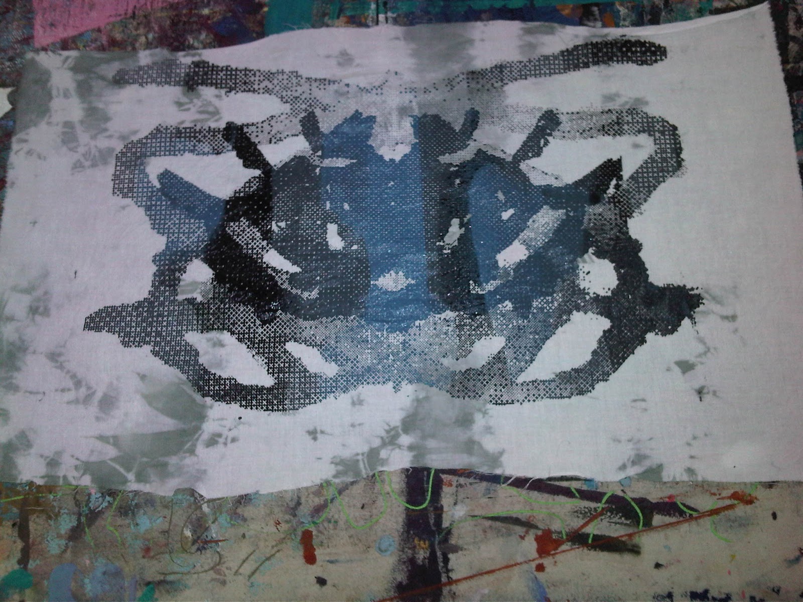
I tie dyed this one a bit more... I personally think its a bit much, what do you think? I'm also not sure on the bitmapping still, more work to do!

Second attempt, prefer this tie dyed background to the one before, I definitely think less is more. Although it doesn't look it from the photo this print actually came out how it should, but I'm still not a fan! It just feels like there's something missing.

First time to use the print in three days and it'll be the last, may possibly look into blowing it up to a larger scale instead, but at this size it just doesn't work.

So I washed off one of my screens, that way I could remove the prints off it that didn't work, and enlarge or repeat to an A3 scale the ones that did. Here's me exposing the screen.

Time to wash off the excess emulsion from where its exposed, can you spot the pattern coming through?

A3 version of bitmap, thought it might work better and I think it did. The multi-coloured effect works better with it to, its still not perfect though so going to look into a bit more, but I'm almost there! YAY!
Love love LOVE this one, definitely a print for the top I think!

Quite like this version on the black as well, although works better on the first one.

More heat press again, fabrics in there with the ink and paper - only takes twenty seconds!

A3 screen print done over the top of the heat press I was doing above - Love it! Definitely a final I think :) - Possibly on the cape with the bitmapping one in someway when I get it perfect!

I'll be updating this again with tomorrows ones, then next week as I am now booked into a glass and ceramics class, hopefully I'll have something to show you from that to. I'm thinking of making glass and ceramic buttons! Quite excited about that, especially and I can push prints into them and make paint bleed on them, should work with my stuff very well if I get it to work! And then after that the rest of the week should be toiling and designing my outfits, and then finishing off at the end with more screen printing, yay! Our printing technician just can't get rid of me haha.
Anyway let me know what you think of todays again :)
For me now its a glass of red wine, hot water bottle for the poorly feet, and perhaps a cheeky bit of Mario Kart... *WIN*
SJ
x
your idea is pretty cool dear! Go on like this
ReplyDelete<3
xx
the cookies
samecookiesdifferent.blogspot.com
Thank you hun :)
DeleteSJ
x